To end poverty we need good data. But we also need that data to be clear and compelling. To support them in achieving that goal, we developed a flexible and distinctive brand identity for Development Initiatives.
Development Initiatives was founded on the premise that without better data on people living in poverty, and what initiatives best help them, it would be impossible to achieve a sustainable end to global poverty. In 2015, the adoption of the UN Sustainable Development Goals (SDGs) – in particular SDG 1: to end extreme poverty – gave the organisation fresh impetus and ambition. They needed an engaging brand to match.
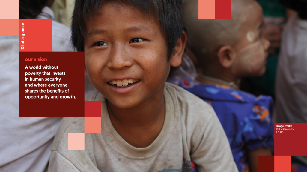
DI’s unique focus on the power of data provided us with an opportunity to go beyond some of the typical tropes found in the international development sector. But it was also vital for the organisation to appear human. A new brand strategy positioned DI as a ‘trusted friend’; a champion of the ability of data to empower others, and a supportive partner for organisations on the ground.
The brand we produced is inspired by the fundamental principles of good data visualisation. It champions transparency, clarity and coherence. This is combined with the warmth and optimism that defines DI’s organisational personality.
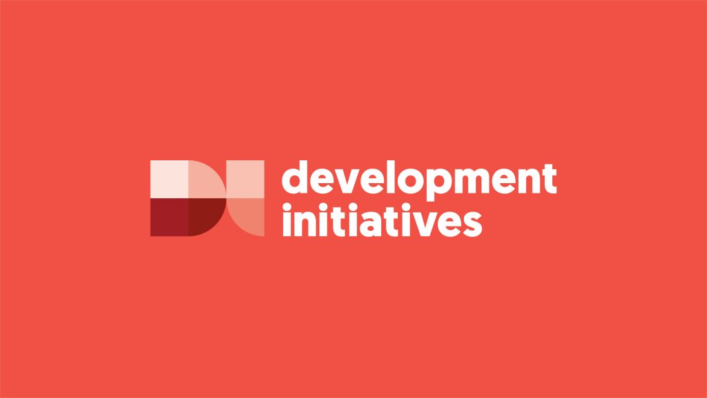
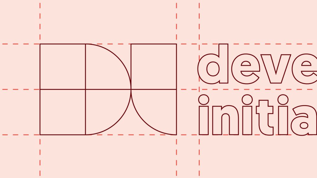
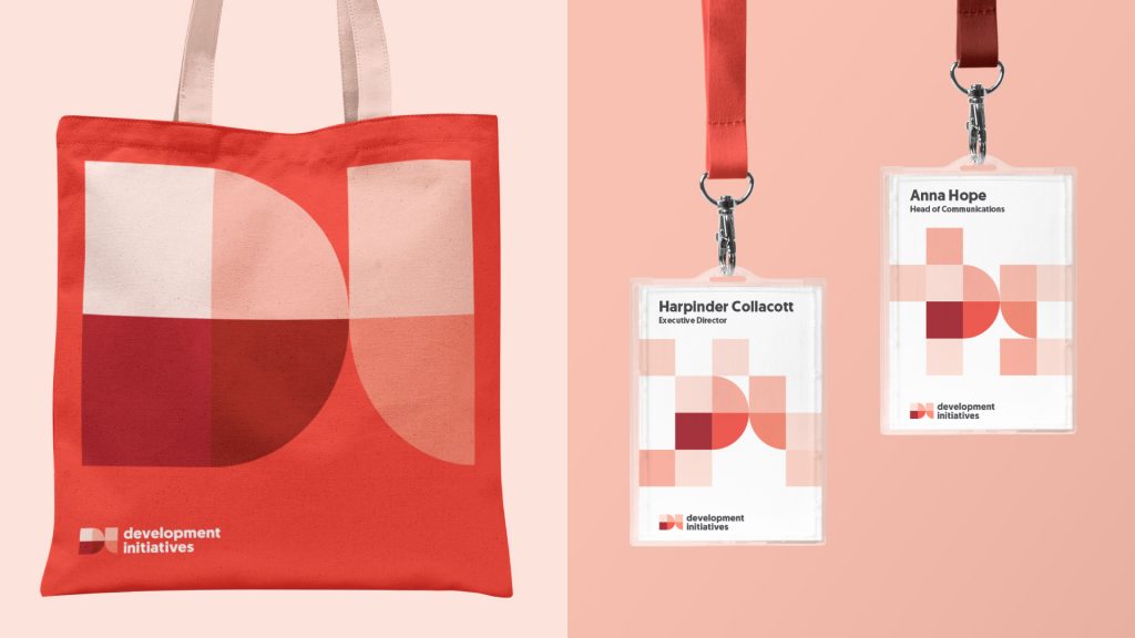
Inspired by heatmaps, dynamic geometric shapes are the heart of the brand’s visual language. Forming the logo icon and extending across the entire system, the vibrant shapes reflect the fluctuating, ever-changing nature of data. To further bring this to life, we also created a series of animated assets for digital use.
Given DI’s data-driven approach, creating a visual system that could be applied to complex information graphics was key. We kept red as the brand’s primary colour but tweaked it to work harder and more consistently across applications. With accessibility in mind, we also introduced a secondary colour palette specifically for use in complex charts, keeping them clear and easy to interpret.
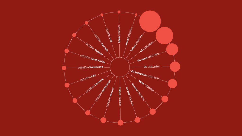
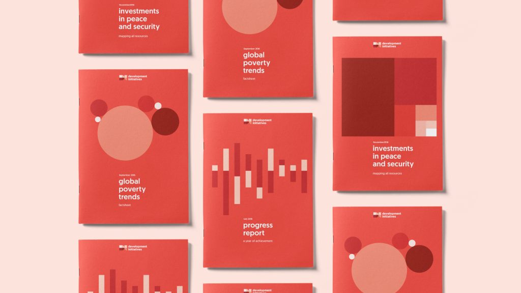
This all comes together in a range of templates, as well as sample styles for various diagrams, tables and charts. Established in an updated set of brand guidelines, this ensures that all outputs reinforce the brand and helps to create long term consistency.
The fight to meet SDG 1 is far from over. Until it is, we hope to work alongside DI to make data to end poverty both beautiful, understandable and, above all, impactful.